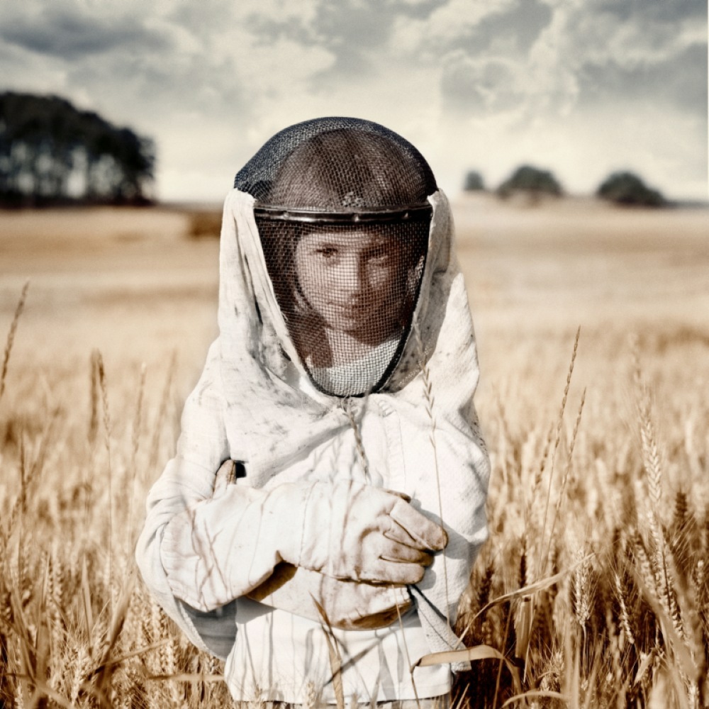
What Muted Photography Means – Essay
Some time ago I was contacted by British student Estelle Penny about my, as she call it, Muted Photography technique. I gave her some information and here you can read the essay:
A comparison of images that incorporate muted colour
Recent trends in photography have dictated the popularisation of an aesthetic of muted tonality so images are visually enhanced and manipulated to lack vibrancy. The altering of the format of a photographunifies the colour pallet to create something, in my opinion that is more appealing and visually ‘perfect’. In this essay I plan to analyse images that represent colour in a muted or altered format resulting in alack of vibrance and brightness.I want to understand why it is that this type of photography is of such interest to me, and also why it has appeared to become a fashionable style through modern ‘apps’ such as Instagram. I have found three main artists that I am going to look at to understand and analyse why they have chosen to adopt a muted style; these are David Heger, Jane Burton and Lynne Collins.
Why/how does muted photography make landscapes look more striking?
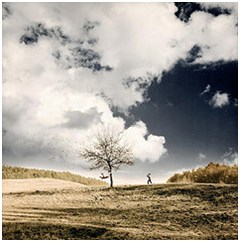
The use of unnatural, reduced colour makes photographs look a lot more powerful and in-depth in my opinion. The two below are good examples because they’d both look very different and ordinary if they were left in their natural colour. The one on the right is an image by David Heger and it is a beautiful image of a field with a tree and a person in it with a cloudy sky in the background. I think his approach to photography is what makes it so extraordinary and what I love so much about his work.Heger lives with his wife and two children, among a hilly land in a small village close to Prague, Czech Republic, he has said“After the visualisation I am looking for the best place to take a shot, spending a lot of time creating decoration and finally, on the right place, composing everything together.”This is shown in his work; it is clear that this image wasn’t taken by chance;the perfect placement of figure to the right of the centred tree was either staged or captured precisely at the right moment.
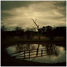 Now, the one on the left (Jane Burton)looks as though it would be a really beautiful photo if it was left normal or even edited so that it was more bright and vibrant. But, Burton has not only muted the colour, but introduced a dark, haunted mood to the image by giving it an almost sepia tone with shadows framing the image. There is a very strong contrast and powerful use of lighting which helps her create a certain atmosphere in her photographs that make the images stand out, looking more influential and profound. Burton’s inspiration from films definitely prompts her work to be more than just a straight photo; she combines feelings with her photography and uses photographic techniques to add these feelings to her work making her pictures more striking.
Is there a similar intention across all of the muted examples of photography? Are there subtle differences?
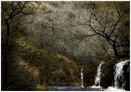 The two images I am looking at are by Lynne Collins and David Heger; these are two photographs that incorporate muted colour but they appear to have different intentions. The first photo (Collins) is of a lonely, yet picturesque scene in a forest. “I am influenced by everything around me, the plight of the natural environment” – it looks as though she wishes to explore the wilderness, nature and environment through muting the colour. The colour of it has then been muted, giving an almost paint-like effect and creating a thick atmosphere in the picture. I think the intention for this image was to simply create a pretty picture but with a mysterious mood and atmosphere. I think the subtle faint colours in the nature and framing the picture make it look fairly hazy and dreamlike. Collins has picked out certain points in the image to add colour to, this relating to a statement of Susan Sontag “In teaching us a new visual code, photographs alter and enlarge our notions of what is worth looking at and what we have a right to observe.” This, meaning the viewer is forced to see the photographer intended in the image.
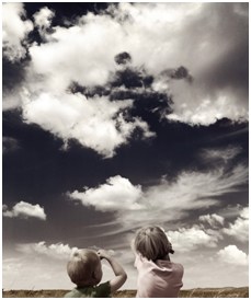
However, Heger’s work gives a totally different meaning to that of Collins mainly due to the human subject matter. His work is very cloudy in tone lacking vibrancy, but this is what makes it so remarkable. Heger manages to create a warm feel of nostalgia in this image, which would not be true had he not muted the color. “I have learned that in every scene should be presented visually attractive and eye-catching story for the viewer. It is also world of brilliant and vivid colors sometimes hidden in twilight, often contrasting and mostly unrealistic. This unreality thing is what attracts me on photographing the most.”I think Heger has a strong attraction to the idea of narrative and storytelling, which is deeply prominent in his photography. He uses color muting to create a more atmospheric feeling and in this particular picture, the exaggerated colors and clouds in the sky play a major part in idealistic mood. Muting color can also create a feeling of nostalgia, and in this picture I personally think it does. Perhaps it also relates to that fact that there are two children perfectly composed in the centre of the frame, but there is a touching sense of sentimental nostalgia, which isn’t uncommon throughout muted photography.
I think, in terms of these two photographs, there is a similar intention within the two as they both give distinctive feelings and draw inspiration from emotions. However, I will say that there are subtle differences; Heger’s piece is definitely warmer and more aesthetically pleasing. I think muting the colour has made the picture as a whole come together, and the viewer can look intently at all the different elements of it. However, Collins’ picture, though beautiful and similar to the intention of Heger’s, has a slightly different affect as a whole. Collins has decided to selectively choose color in different places within the photo, creating a mysterious yet scenic feel to it. I think there is a more confused style, with darker colors producing a different (although similar) photograph and a different intention behind it.
David Heger: The Rise of Technology
Heger’s work is my favorite out of all of the photographers I’ve studied for this essay. I really appreciate the subtlety of his pictures, because although often simple, they are incredibly in depth, and powerful for the viewer. Because of this he manages to incorporate muted color fabulously within his style of photography, as it creates mood, feeling and texture almost within his photographs. Heger also acknowledges a very important impact on photography in modern times and muted photography.“With the rise of smart phones, photographers from all backgrounds worldwide are embracing new technology to tell their stories in innovative ways. Photography has emerged as a new trend, but until recently required special tools and know-how.”Instagram is a phone app and online website that allows anybody to replicate vintage and muted photography alongside enabling them to almost create their own piece of ‘art’ (photography). This all links with the idea of ‘perfection’ within photography; by using these apps and tools, we are able to make photos look however we want, which is often, perfect. Muting the color of an image is simply to change the tone, mood, atmosphere and feel of a picture into whatever you choose by eliminating the bright, gaudiness of it without making it black and white. It is simply a means of making your photography perfect; Heger recognizes this in recent years, as he has always used this technique professionally in his own work leaving his photography flawless and beautiful.
To conclude, all the images and photographers I’ve studied represent different styles of muted photography incorporating different themes, techniques, moods and emotions. Overall, they do all have things in common; each of these photographers draws from their elements of a dreamlike phase as inspiration for their work, whether it is magic, mystery or even old paintings of something unreal.

